Framing U and I
25 Feb 2021
What is a UI Framework?
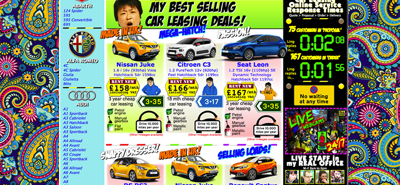
UI Frameworks are styles that you can use on your website through use of CSS and HTML code. UI Frameworks can really boost the look of your site into an attractive thing that users would want to click around on. Many websites can benefit from utilizing UI Frameworks like Ling’s Cars which is one of the most infamous sites for having the worst eye-gore site to ever grace the internet. It’s been updated in the recent years but it still aims to be an eye-sore and it does it well, its apart of the novelty since its such an old site and has been hearlded as the worst site design on the net.
I have started to use Semantic-UI for my current UI Framework of choice because of my current computer science class and so far I am enjoying it since it is easy and verstile UI framework to use. All documentation is available on the semantic-ui.com website, it is easy to read with illustrations. I believe that anyone can learn how to code using Semantic-UI within an afternoon, but mastering it may take quite a while. I have had some trouble myself trying to recreate websites using Semantic-UI with understanding how things are spaced and how containers, menus and grids are used. But after getting over that difficulty curve it was pretty easy to understand the other parts of Semantic-UI. Semantic-UI tends to keep things easy to digest and easy to use.
Now for the Semantics
I remember back in high school one of my engineering teachers allowed us to learn a little bit of HTML, but the thing was that it was only HTML not even CSS so our sites looked extra basic. However, looking back on it I wished that either the school was funded more to do some basic website design or for my teacher to push me in the right direction to learn web design because I am kind of enjoying it so far. I still remember my poor HTML site that just had a bland blue background with pictures coupled right next to each other with no smooth looking design or attractive appeal. I should recreate it one day to just show the juxtaposition of how far I have come since then.
My Recreation and Plans for the Future
I have actually recreated a site of one of my favorite music artist merchandise store, Joji, and it was kind of a lifting experience. I had actually enjoyed recreating the site using Semantic-UI because I got to take a lot of time looking at my favorite artist. Although I do think I took too much time to recreate his site, but I wanted to give it as much time and my 100% because I like him so much. The recreation was for an assignment but I kind of wanted to go a step further and implement some of my own design ideas that would make the site more impactful. However, I am not entirely sure how I would implement it. But by the end of the course that I am taking now I will for sure know how to implement some advanced design effects that I have fermenting in my mind. One of these ideas is to have a bright red outline across the outline of the store merch when you hover over it. Although, I might be overthinking things since there is beauty in simplicity which the Joji site definitely aims for, and I also believe in the opposite where there is ugliness in too much detail; see the previously mentioned Ling’s Cars website.
Although I want to recreate a bunch of my favorite music artists merch store sites, I want to create a site of my own to push the limits of my own creativity. Making a website from scratch sounds pretty fun to me, I get to put a bunch of easter eggs for myself and create my own inside jokes. This will serve as good practice and will show that I can create multiple sites from scratch or given some materials. As practice I should take requests from my friends to create sites for them, whatever they want, this will serve as good practice for me and show that I can follow directions given by clients. By the end of the course I hope to become a professional at UI, HTML, and CSS so that I can make my own things and create some pretty attractive sites.